Never judge a book by its cover.
If you've read my blog, you've probably heard me refer to myself as a shameless (SHAMELESS!) cover-judger. I know, I'm seeking help. But I don't think I'm the only one out there who does it.
So I invite you, readers, to share your opinion, and maybe we can find a cure for this problem together...or not.
Let the (shameless! SHAMELESS!) cover-judging begin!
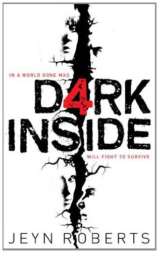
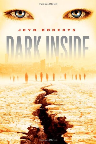
Okay, the cover on the left is the UK cover, and the right one is the US/Canadian cover.
And I’m going to be completely honest about this…I don’t know which one I like better.
I know. This has never happened to me before. Help!
On the one hand, I like the stark black and white with the splash of red on the UK cover. It’s all violent (which totally fits the feel of the book. Trust me on this). I like the faces that can be seen on the edge of the crack that stretches down the middle. On the other hand, I really REALLY don’t like the use of “4” instead of “a” in the title. It bothers me. I know that the story follows four characters, but it makes the title look strange and disjointed to me. Like the title is really “d4ark inside”, which it’s not. (c’mon…back me up on this one!)
As for the other cover—and this is the cover that was on my review copy—I don’t know. Nothing about it really drew me to it. After I started reading the story, I took another look at it, and noticed that, yes, it does have several elements from the book, but…*shrug*. I don’t like the eyes. Maybe it’s just me, but I don’t like eyes on covers. I find it really drew my attention away from the bottom half of the cover, which upon actually, you know, NOTICING it, I LOVED. Seriously. Click on the right cover and take a look at the bottom half. It’s all end-of-the-world-type creepy. Love! But the eyes at the top—while an important element of the story—proved a little too distracting for me.
I’m having a really tough time with this, guys.
What are your thoughts?
(tell me! I must know!)
-geekgirl
If you've read my blog, you've probably heard me refer to myself as a shameless (SHAMELESS!) cover-judger. I know, I'm seeking help. But I don't think I'm the only one out there who does it.
So I invite you, readers, to share your opinion, and maybe we can find a cure for this problem together...or not.
Let the (shameless! SHAMELESS!) cover-judging begin!
click the covers for a closer look!
Since mankind began, civilizations have always fallen: the Romans, the Greeks, the Aztecs…Now it’s our turn. Huge earthquakes rock the world. Cities are destroyed. But something even more awful is happening. An ancient evil has been unleashed, turning everday people into hunters, killers, crazies.
Mason's mother is dying after a terrible car accident. As he endures a last vigil at her hospital bed, his school is bombed and razed to the ground, and everyone he knows is killed.
Aries survives an earthquake aftershock on a bus, and thinks the worst is over when a mysterious stranger pulls her out of the wreckage, but she’s about to discover a world changed forever.
Clementine, the only survivor of an emergency town hall meeting that descends into murderous chaos, is on the run from savage strangers who used to be her friends and neighbors.
And Michael witnesses a brutal road rage incident that is made much worse by the arrival of the police--who gun down the guilty party and then turn on the bystanding crowd.
Where do you go for justice when even the lawmakers have turned bad? These four teens are on the same road in a world gone mad. Struggling to survive, clinging on to love and meaning wherever it can be found, this is a journey into the heart of darkness – but also a journey to find each other and a place of safety.
Okay, the cover on the left is the UK cover, and the right one is the US/Canadian cover.
And I’m going to be completely honest about this…I don’t know which one I like better.
I know. This has never happened to me before. Help!
On the one hand, I like the stark black and white with the splash of red on the UK cover. It’s all violent (which totally fits the feel of the book. Trust me on this). I like the faces that can be seen on the edge of the crack that stretches down the middle. On the other hand, I really REALLY don’t like the use of “4” instead of “a” in the title. It bothers me. I know that the story follows four characters, but it makes the title look strange and disjointed to me. Like the title is really “d4ark inside”, which it’s not. (c’mon…back me up on this one!)
As for the other cover—and this is the cover that was on my review copy—I don’t know. Nothing about it really drew me to it. After I started reading the story, I took another look at it, and noticed that, yes, it does have several elements from the book, but…*shrug*. I don’t like the eyes. Maybe it’s just me, but I don’t like eyes on covers. I find it really drew my attention away from the bottom half of the cover, which upon actually, you know, NOTICING it, I LOVED. Seriously. Click on the right cover and take a look at the bottom half. It’s all end-of-the-world-type creepy. Love! But the eyes at the top—while an important element of the story—proved a little too distracting for me.
I’m having a really tough time with this, guys.
What are your thoughts?
(tell me! I must know!)
-geekgirl
Ooh I agree with you! I think the North American cover would be even better without the eyes. And the 4 on the UK one just really bugs me and stops me from loving it. Both of them are generally pretty good, though!
ReplyDelete